Sunday, December 30, 2012

Thanks for Listening III


As another year closes I want to express, to all of you, my heart felt appreciation. Thank you for your support and encouragement, it's been a great year.

And to my loving wife, Linda there is no words that can express my appreciation and love for you. Happy Anniversary.

So, I'll finish this thought with these fine words...


To laugh often and much;
to win the respect of intelligent people
and the affection of children;
to earn the appreciation of honest critics
and endure the betrayal of false friends;
to appreciate beauty; to find the best in others;
to leave the world a bit better
whether by a healthy child, a garden patch,
or a redeemed social condition;
to know even one life has breathed easier because
you have lived.
This is to have succeeded.

                                              ----Ralph Waldo Emerson


Happy New Year !


Explore - Question - Learn - Enjoy, Jim


Wednesday, November 28, 2012

Inspiration is for amateurs; the rest of us just show up and get to work.

                                                                                         Chuck Close


This is a fascinating glimpse into a amazing artist with a unique philosophy of life. Well worth the watch. True inspiration. If you don’t know much about Chuck Close’s life you should definitely investigate, as his life and times are as interesting as his works of art.


"Every great idea I've ever had grew out of work itself."

“The advice I like to give young artists, or really anybody who'll listen to me, is not to wait around for inspiration. Inspiration is for amateurs; the rest of us just show up and get to work. If you wait around for the clouds to part and a bolt of lightning to strike you in the brain, you are not going to make an awful lot of work. All the best ideas come out of the process; they come out of the work itself. Things occur to you. If you're sitting around trying to dream up a great art idea, you can sit there a long time before anything happens. But if you just get to work, something will occur to you and something else will occur to you and something else that you reject will push you in another direction. Inspiration is absolutely unnecessary and somehow deceptive. You feel like you need this great idea before you can get down to work, and I find that's almost never the case.”
                                                                                                              ― Chuck Close


Links:
CBS This Morning
Chuck Close's advice to his younger self
Pace Gallery
Chuck Close Website


Explore - Question - Learn - Enjoy, Jim


Tuesday, October 30, 2012

Primary Color Triads


All colors can be mixed by simply using the three primary colors: red, blue, and yellow, as we know.  However there are a great variety of red, yellow and blue hues available to the artist and to gain an understanding of the diversity and range of those primary triads you really have to mix them. Mixing colors with a limited palette will not only give you great insight into color mixing but produce inherent color harmony.  Select three variations and experiment.


These color wheels are a triad of Yellow Ochre, Burnt Sienna and Ivory Black. I have really become fascinated with these three colors. They have become the core primary set on my palette, more often Ultramarine Blue instead of Ivory Black. I wanted to visually see this color wheel with black and the primary triad color harmony, in which..... I immediately saw Anders Zorn, Eugène Delacroix, Winslow Homer and Titian's palette. Amazing that after you familiarize yourself with the mixtures they often show up in master painters work.


A good painter needs only three colours: black, white and red. 
                                                                                                                                -Titian


Draughtsmen may be made, but colourists are born.
                                                                                                          - Eugene Delacroix


Hue -pure color
Tint - hue with white
Tone- hue with gray
Shade - hue with black
Value - the lightness or darkness of a color


Explore - Question - Learn - - Enjoy, Jim


Saturday, September 29, 2012

Boxwood and Blue

Buxus sempervirens


From all the small bottles I've collected, somehow this little blue bottle keeps finding its way back into a painting. I just really like the square shape and the way light refracts through it almost like a small piece of stain glass or a mosaic with many facets of color.


I started this piece with a very loose grisaille ("griz-eye") to establish my basic structure and design. The underpainting suggests form without being too committed. I knew the only way to get the transparency of the bottle was to glaze with transparent and semi-transparent passages of color. The color stage of this painting went very fast requiring just the slightest use of color to create form and dimension.


Boxwood in Blue Bottle Oil on Panel 8x10

You can find more demonstrations and videos on underpainting techniques by looking under "labels" in the side bar or following the links below. You can find all of my instructional demos on my You Tube Channel, don’t forget to subscribe.


Links:
 Underpainting Techniques
 Grisaille Demonstration
 Video Demonstrations on my YouTube Channel


Boxwood - Buxus sempervirens
The American Boxwood Society 


Explore - Question - Learn - - Enjoy, Jim


Tuesday, August 7, 2012

Robert Hughes - Art Critic and Historian - 1938 - 2012


"One gets tired of the role critics are supposed to have in this culture: it's like being the piano player in a whorehouse; you don't have any control over the action going on upstairs."

Hughes had a unique ability to demystify the art world, a elegant speaker that wrote with passion, insight, and humor he was not afraid to express an opinion, even when that opinion was not the popular one. His works, writings, books and documentaries have been a inspiration to myself and countless others.
Robert Hughes will be missed.

You can watch his entire BBC documentary on this You Tube Channel.


"The new job of art is to sit on the wall and get more expensive."


"Drawing never dies, it holds on by the skin of its teeth, because the hunger it satisfies – the desire for an active, investigative, manually vivid relation with the things we see and yearn to know about – is apparently immortal."


"So much of art – not all of it thank god, but a lot of it – has just become a kind of cruddy game for the self-aggrandisement of the rich and the ignorant, it is a kind of bad but useful business."


Robert Hughes Obituary by Benjamin Genocchio
"Looking back, he was the greatest prose stylist since Ruskin to write art criticism." 


The Shock of the New BBC Documentary
Robert Hughes on Modernism
Robert Hughes on Rembrandt
Robert Hughes on Damien Hirst
More Quotes at The Daily Beasts

The Shock of the New on Amazon


Explore - Question - Learn - Enjoy, Jim

Wednesday, July 25, 2012

Blackeyed Susan Oil Painting Demonstration


Rudbeckia hirta, the Black-eyed Susan


I wanted to show my basic still life set up used on small oil studies. Normally when working sight size, I would use the same lighting on the still life as the canvas panel.
Because fresh flowers can change so quickly I decided to use two artificial light sources to have some control over the set up and painting time. In this painting I am lighting the subject with one flood lamp and the canvas panel with a second color balance lamp. I am using a large drawing board to isolate one flood from the other.

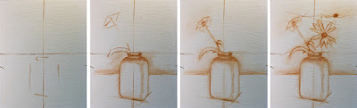
I have attached a plumb line to the center of my shadow box that will be used as a vertical axis to which I will plot reference points to and on a corresponding center reference on my canvas. I am using it to establish heights and using the full length of a brush (or a chop stick) horizontally to establish basic widths and reference landmarks. I also use the stick to check directional measurements; I like to call this “Clocking the Drawing”.


When measuring from one point to another on a diagonal, imagine a clock face and think of the lines you are drawing as the hands of the clock, a point may start at five o’clock and reach to say eleven o’clock. By measuring vertical and horizontally and around the dial you will build a weave of reference points that will increase the precision and foundation of your drawing. I have a demonstration and video that covers the subject of sight-size and mapping a drawing here that you may want to check out.

 I have a very thin coat of medium on the panel that will be worked into, I can smudge and wipe out my line work easily as I check and rework my drawing. I block in my drawing with some burnt sienna, the halo around some of my lines are left over from adjustments to the drawing and composition. I am visualizing where the center of interest and focal point are to be, so I move things around a great deal at this stage, composing my picture plane and thinking about design. What I want as a sketch is a good foundation of the basic proportions and the contour edges.

I spend a lot of time looking at my set up with a view finder and reducing glass to help me establish my composition. I know what you’re thinking, not much to this setup, but I really think every great work starts with a great design. I can look at a painting from across the room and tell you if I want to have a better look or not. If those big relationships ( formal elements of art, form, shape, value, color, space, ) do not work at a viewing distance they will not work any better with my nose up against it. Paintings are to be viewed not smelled.


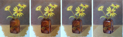
With my composition established, my approach to this painting will be capturing as much info as I can in each pass. The Black-eyed Susan’s are already past their prime and suffering the effects of our recent drought, so I want to concentrate on those fleeting floral elements first. I worked in both a direct (alla prima or wet into wet) and indirect method (successive layers of color applied opaquely and transparently) on the remaining elements. Using a fast medium and following the “Fat-over-lean” rule I should have a dry surface overnight and get three to four painting sessions with this subject before it expires.


In my first pass, I use full color laid down with diluted paint. I want to work with the pigment that is lean but somewhat opaque and attempt to finish each passage as I go.
The goal is to state each shape, by hue, value, chroma, working from simple to complex.
Working very deliberately, I am concentrating and thinking edges and shapes and how one relates to another. At this stage I am painting wet into wet trying to bring each part to its finish.


“Paint what you see, not what you think you see”, a maxim that one hears repeated often. Why, because it is one of the hardest things to do, letting go of assumptions, preconception and visual short hand that have been ingrained in us. We can not see what is in front of us because too often we let “What We Know” or think we know get in the way of what we actual see and it ends up that literally “ We can’t see the Forrest for the trees” .


We must try to see objectively and think in terms of the relationships between color and shapes not the object. Relating one to the next in terms of basic formal elements, shape, color, edges, value and the organizing principles of design, balance, proportion, emphasis, unity, all on a very complex and abstract level.

There is a intimate hierarchy of interaction when painting, sort of like doing a large jigsaw puzzle where one connects one piece to another in order to build this bigger picture. And that is where the real challenge is, without getting caught up in unnecessary details, obtaining the big picture and the revealing to the world through these aesthetic choices and our visual observations, something meaningful. Almost as hard to write about as to do.


“The whole is more than the sum of its parts.”  Aristotle


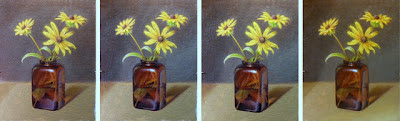
In the first sitting I wanted to record as much of  the Black-eyed Susan’s while they were fresh. In the second sitting I can work a bit slower and concentrate on bringing areas to a finish, using layers of paint and glazes and to zero in on the focus I want. I do my fine tuning here, adjusting and readjusting, checking the drawing, softening edges, relating and restating shapes, bearing down on shapes and modeling form. I look very carefully at color relationships and masses, trying to pick out those subtleties that best describe form and help convey a sense of dimension. I work very slowly trying to be selective on what I add and do not add, asking myself if it will add anything to what has already been said? Definitively more "Look" than "Put". It has also been said that painting is nothing more than a series of corrections.


I also believe painting is a visual conversation, where you ask a series of questions about each element and relate them to the whole. If those elements are working well together the image will come into focus. With the layered approach you can fine tune the painting with subtle modeling from beginning to end, until you reach the level of refinement you wish. If one does this thoughtfully, all kinds of what I call “painters epiphanies” about the image will reveal themselves. When all of the questions have been answered the truth is known.


"The main thing is to get the right color and value in the right place, in the most direct and natural, in the least affected manner possible.
Daniel Burleigh Parkhurst


Black-eyed Susan, oil on panel, 8x10
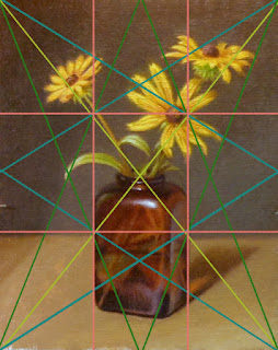


Harmonic Armature

Rule of Thirds and Harmonic Armatures
Are compositional tools that place the focal points or center of interest on the points of intersection, and considers the location of elements based on those lines and intersections. Composition is the aesthetic location of elements in a picture, the Rule of Thirds assists in locating the intervals that the human brain most favors as the point of interest and compositional harmony (harmonics) is the visual movement or pathways in a picture plane. All of which are powerful tools to help one judge and develop a intuitive sense of proportion and design (for composition).

I wanted to throw this in because although I do not sketch the armature onto the canvas I do have it marked on my view finder. I am always very conscious of these design tools when composing also understanding how the eye moves through an image. With just a little forethought, I think this armature came out nicely.
These are rather short explanations and composition is a huge topic to get into, I think, a post for another time.

Black-eyed Susan Video
You can watch the painting develop in this video. I tried to minimize the glare so you could see the painting develop in passages from the lay-in to finish. The trade off was that the color accuracy changes some through the video. But what I think it shows, and I hope you take from the video is some insight into the process of the layered method.


 Explore - Question - Learn - Enjoy, Jim


Further articles on this topic by Jim Serrett
Charcoal Demonstration, sight size and comparative measurement
Underpainting Techniques – Demonstration Four - Copper Pot Video
The whole is greater than the sum of its parts, learning to simplify, Pochade Box paintings

Links
Elements of Art
Principles of Design
The Golden Mean
The Rule of Thirds

Saturday, June 30, 2012

Blue and Gold


Blue and Gold   oil on panel   5x7


Still life set up


Two antique bottles with a pussy willow branch painted with my earth toned palette from life. One can get a better feel for color and value from the angled shot in the frame.


This work is available framed


Explore - Question - Learn - Enjoy, Jim

Wednesday, May 30, 2012

Exploring Color Palettes


How a painter lays out the colors of their palette and the colors they choose is an insight into their painting process. A artist looks at the arrangement of paint piles on a wooden palette as the musician looks at the strings of a guitar. They represent the creative possibilities of describing the visual world through color. Color is described by three qualities hue, value and chroma, together those three components are referred to as a “color note”. So when you look at a thing and say I will describe it with paint, you are actually saying, I will create in some abstract pictorial space that exact shape in hue, value and color with a brushstroke. Or more exactly a color note.

My palette charts are based on a limited palette of yellow ochre, burnt sienna, burnt umber, and ultramarine blue, which offer a surprising range of color and value relationships on their own. The pure color is on the left with two steps of white.  I have written about earth palettes and limited palettes here before, you may want to read those articles also.


The greatest masterpieces were once only pigments on a palette. 
(Henry S. Hoskins)


These color notes come from an array of pigments spread across a palette, learning to control and understand that palette is important. Building knowledge of their relationships and how colors interact is much like (using the music analogy again) learning the scales. Most students start with a limited palette of colors and as they become knowledgeable of how they interact, expand the palette slowly.

The idea is to develop a method of working with color that becomes intuitive, color mixing should be a non-cognitive action so that you can find a color note quickly and effectively without interfering with your creative process. Clapton never stopped in the middle of a guitar solo and said, “Crap, where’s the key of C ?”


Expanding on this core set of earth colors I selected colors that would give me further variations on the primaries, a warm and cool in each family with some colors of convenience and modifiers such as sap green and raw umber. The experience of making puddles of paint and experimenting with them to learn which colors are cool or warm, transparent or opaque, and how they relate to each other is an important part of understanding color harmony and color mixing.


This last palette is a classical palette I have come across a few times and experimented with, how historically accurate it is I am not sure. However Gamblins Oil Colors, which is a very reputable source sold this set of colors as an Old Master Palette. With lots of warm earth tones and contrast this palette really has that old master feel to it. I could see Titian or Rembrandt using this palette. A good resource for the history of paints used by artists is Pigments Through the Ages.


Everything that you can see in the world around you presents itself to your eyes only as an arrangement of patches of different colors. 
(John Ruskin)


Links
Three Color Palette
Earth Palette

Explore - Question - Learn - Enjoy, Jim Serrett

Monday, April 16, 2012

Google Art Project Updated


Most artists I believe, are familiar with the Google Art Project launched back in February 2011; based on Google’s Street View technology we were able to wander virtually through 17 partner museums by clicking on the gallery’s floor plan.


In their second launch Google has added another 151 galleries and museums to its Art Project, the platform features over 32,000 artworks from 46 museums. One nice feature is the ability to select either "Museum View" or "Artwork View" for each museum.


The updated interface and new search features allow the user to find artworks by period or type of artist. You can look at the collections within one museum, or the collective inventory of one artist in all participating museums. Above are the results from selecting "Artist", then Albrecht Durer, which gave me 45 works that I can scroll through or play as a slideshow.


The image quality is excellent, and the zoom tool will make you think you are actually there. The "My Galleries" tool allows you to create/save/share your own virtual gallery (look out Pinterest) from some of the most prestigious museums in the world. I promise you that hours can vaporize on this site, just keep reminding yourself of how great an educational tool and resource this is.

Explore - Question - Learn - Enjoy, Jim

Thursday, March 29, 2012

Bottle Collection + Earth Tone Color Chart


Bottle Collection - Oil on panel 8 x 10 inches © Jim Serrett

The painting on my easel is a study of bottles done with an earth palette.
I have really enjoyed working with these limited palettes; they have an innate natural harmony and subtlety.


The chart is the studio palette I have been using for several recent works. The color chart is comprised of just four hues, yellow ocher, burnt sienna, burnt umber, ultramarine blue, and white. These low key earth palettes will make you look closely at building color relationships and thinking about color saturation.

Much of the subtly in these color families can not truly be seen or appreciated unless you actually mix one of these charts. For example ultramarine blue mixed with burnt sienna or burnt umber produce two beautiful mixed blacks and an entire range of warm and cool grays. This is what I used in the study Bottle Collection and in the chart for my mixed black or shade.


Explore - Question - Learn - Enjoy, Jim


Saturday, February 25, 2012

Bunch of Grapes WIP


I have really enjoyed these grape paintings, they have been truly demanding. The color complements are fascinating, a very complex series of color triads that produced a natural harmony.


Seeing the bunch of grapes as a whole or mass and dealing with the individual reflective effects is not easy. Funny, is it not, how things you think will be a breeze to paint turn into some of your biggest challenges.


Painting for me is all about solving a set of visual problems, solve those visual problems and a likeness of your initial impression will emerge. Even so there are times I just have to sit and observe my subject and decide how much more to push, or should I even dare to push it more. Have I said everything I needed the image to say?. Is it saying what the image was suppose to convey? Have I kept to the “big” idea that attracted me in the first place? Am I done? Sometimes I think it is best to leave the entire visual stimulus, and return later with a fresh eye and mind. So for the time being this will be a work in progress.

“Art is never finished, only abandoned.” 
                                                                         Leonardo da Vinci


Explore - Question - Learn - Enjoy, Jim


Friday, January 27, 2012

Interview with Jacob Collins by David Yezzi


Jacob Collins, Self Portrait, 11x9

Jacob Collins is certainly one of the most accomplished realist painters of our time, his contribution as an educator is unequaled. A driving force in the Realist Revolution to revive the art of traditional painting, Collins through his schools and ateliers (Grand Central Academy / Water Street Atelier) has already trained a generation of new artists racking up an impressive list of alumni.

Collins at times seems reluctant to take on the role of leader for the movement but I can not imagine where the state of contemporary realism would be with out him.


Jacob Collins, White Peonies, 16x18

 In this great article from The New Criterion's David Yezzi interviews Jacob Collins about his life, work and the world of figurative art in which he covers Greenberg, the new aesthetic and kung-fu.


Jacob Collins, Reclining Nude Morning 32x56


An interview with Jacob Collins by David Yezzi - The New Criterion


  Links
Adelson Galleries New Works by Jacob Collins

Explore - Question - Learn - Enjoy, Jim