Showing posts sorted by relevance for query Underpainting Techniques. Sort by date Show all posts

Sunday, August 27, 2017

Underpainting Techniques – Demonstration Six - Part II – WIP


First Color Pass: These are the first color layers over the underpaintings. I have attempted to develop each one equally and establish a similar refinement. It is obvious from the beginning the degree of finish or resolution is more observable in the further developed monochromatic underpaintings.

When I speak of “resolution” I am using it to describe the degree of focus, that with each color pass over the image you make small corrections and adjustments, slowly tuning in the image to the level of three-dimensional reality you wish to see in your painting. With this slow dialing in, each pass should be about fine tuning not correcting and selective focus instead of detail. That is key to moving forward towards you’re vision. The artist Sadie Valeri explains this dialing in like this, “that in every layer of the painting you get 50% closer to reality “and in each additional layer fifty percent more so on. Each one growing exponentially (building) on the last until you achieve a high degree of realism.


Form Painting: So, in the First Pass I wish to make the big statements of color, shape and edges over the value study and drawing.  I want to think about color relationships comparing abstract passages of paint by chroma and temperature. To think about form, that each brush stroke exists in three-dimensional space and state where it is in light and where it is in shadow. The concept of light on form or modeling dimension like a sculpture is often referred to as Chiaroscuro – The contrast of light and shade. The act of modeling light and dark is called “Turning Form”. I like that adage because it simply describes the goal of representational painting to create the perception of depth.

My paint consistency varies depending on which underpainting I am working with but basically, over top of the underpainting I am using thinned transparent glazes which I then work into with more opaque paints wet into wet. Building up of transparent, semitransparent, semi-opaque, opaque and impasto layers of paint (glazes, scumbles, velauturas, impasto) that create different optical effects.


Starting top left moving clock wise- Grisaille, Bistre, Ébauche, Imprimatura.

I am not quite ready to lose my drawing yet, plus I need the values to affect the color passages and to build luminosity and depth. In each paint passage I continue comparing hue, value, chroma, edges, and textures.

I think form and atmosphere, not things. Painting the points of contact, reflected light, the hills and valleys as light rakes across the subject I look for delicate passages and subtle shading. I look for the “air” around the subject, (as odd as that sounds) and try to paint the atmosphere.

Hue - is a color’s characteristic, where it lies in the color spectrum, (the color name)
          and which temperature it leans towards, warm or cool.

Value – is the relative degree of grayness, lightness or darkness of a color.

Chroma – is the colors intensity, the degree of brilliance of a color, from intense to dull.


Chiaroscuro, (from Italian: chiaro, “light,” and scuro, “dark”) 1. The contrast of light and shade and the art of distributing these elements in a picture planes. 2. Light and shade as they define three-dimensional objects


Summary: The main purpose of underpainting is to solve the problems of composition, drawing and value so that you can concentrate solely on the application of paint. Using a variety of techniques to realistically create the illusion of depth, form and atmosphere. (The amount of light, depth and atmosphere you can achieve in this manner is almost magical.) Multiple veils of transparent color contrasted by opaque light passages, produces a level of realism that I believe cannot be matched with other approaches. You literally carve out volume with this method.

Which type of underpainting to use, Grisaille, Bistre, Ébauche, or Imprimatura is about knowing the strengths of each and being able to look at an object as say, “Yes this approach will work best to achieve that", kind of knowing which tool to reach for in the tool box. I was going to go into my thoughts on each and compare strengths and weaknesses? But feel it better to not muddy the waters with that and let people come to their own conclusion. Maybe I will touch on it later, but for now I will say there is a wealth of knowledge within these methods to explore and doing so will expose how to get the maximum impact of what the material can do.

As a Realist, it is important to have a comprehensive range of techniques to draw from and expand your artistic vocabulary.


You can find Underpainting Techniques – Demonstration Six - Part I – WIP here.
You can access more Underpainting Demos through the labels in the side bar or use the search box at the top left of the blog.


Explore - Question - Learn - Enjoy, Jim 


Website - jimserrett.com 
Studio Blog - jimserrettstudio.com 
 Landscape Blog - Pochade Box Paintings


Monday, July 31, 2017

Underpainting Techniques – Demonstration Six - Part I – WIP


In this demonstration, I will attempt to compare the different methods of underpainting technique used and developed by artist prior to the 20th century. Just walk through any museum and compare the 20th century wing to the 19th and on to 15th century. It becomes obvious that those artists where doing something different, they were using paint differently. They had a vast vocabulary when it came to making marks with paint and with it they could create great illusion of space and form.

Painting in an indirect method, building layers up of transparent, semitransparent, semi-opaque, opaque and impasto layers of paint create different optical effects. The purpose of this is to achieve three-dimensional space, through the refraction of light, what is called “Turning the Form.”

The most important illusions of realism in a painting are Form and Value. And by using the underpainting to divide the image into manageable parts, the drawing, the values and lastly color, they could focus on the actual mechanics of applying paint. They created this amazing tool box of techniques, which liberated them, where they could slowly tune in on the level of realism wanted. Thus allowing these artists to create at a higher level of expression and produce some of the greatest masterpieces in history.


Starting top left moving clock wise- 

Grisaille – (griz-eye’) fr.-  A grey underpainting done entirely in monochrome shades of gray or another neutral color, to produce the illusion of relief sculpture.


Bistre - (the wipe-out method) – An underpainting using warm browns (usually raw umber or burnt umber). A thin coat of umber is painted or rubbed over the canvas and then ‘wiped out’ or lifted using a rag or a bristle brush and a small amount of solvent. Darks are built-up with thicker and leaner layers of umber in a near dry brush approach.


Ébauche – (ay•boash ) fr.  - or first block-in with color or color sketch. This creates the overall general feel and effect of the painting with colors and values.  Leaving a sympathetic underpainting or foundation similar to a watercolor.


Imprimatura is an initial stain of color painted on a ground. It provides a painter with a transparent, toned ground, which will allow light falling onto the painting to reflect through the paint layers. The term itself stems from the Italian and literally means "first paint layer". It's use as an underpainting layer can be dated back to the guilds and workshops during the Middle Ages; however, it came into standard use by painters during the Renaissance, particularly in Italy.


Alla-prima – Italian expression loosely translated “at first try”. Direct painting (wet into wet), a method which is completed in a single session without previous preparation or later layers of paint.


I will be continuing along with the indirect painting technique over these underpaintings, using layering, glazes, scumbles, and velauturas to create a illusion of three dimensional form.

So, I invite you to visit again as the paintings evolve.


You can access more Underpainting Demos through the labels in the side bar or use the search box at the top left of the blog.

A couple of quick Links:
Bistre Method – “wipe out”     
Grisaille Underpainting  


Explore - Question - Learn - Enjoy, Jim 


Website - jimserrett.com 
Studio Blog - jimserrettstudio.com 
Landscape Blog - Pochade Box Paintings


Sunday, March 27, 2011

Underpainting Techniques – Demonstration Four - Copper Pot Video


The Copper Pot painting is another exploration of traditional oil painting techniques.
With a grisaille the artist develops form and value, separate from color.
By glazing color over the grisaille (monochrome underpainting) the shading (values) is already established, creating the correct values essential to realism.

The indirect method or the process of painting in layers allows for a wide range of approaches, techniques and effects, starting with a grisaille. The artist has a full arsenal of painting methods at his disposal, scumbling, sgraffito, frottie, scraping, rubbing, blending, hatching, impasto, velaturas and glazing. A range of painting techniques that makes complete use of the unique characteristics of oil painting.

In two earlier posts I went over the charcoal study and grisaille underpainting which you may want to review.


As I start working with color I establish local colors for each object describing them by (hue and chroma). Hue is a color’s characteristic, where it lies in the color spectrum, and which temperature it leans towards, warm or cool. Chroma is the degree of brilliance a color has, from intense to dull. The first passage of the color lay-in is thin enough so the grey underpainting will show through and modify the hue producing (value).
 The basic values will be established by the underpainting, but unlike direct painting, (alla-prima) the hue and chroma can be modified by any of the techniques listed above. The temperature, chroma and value can continually be manipulated by transparent and semi-transparent passages of color. Thus, what is so interesting in this approach is that the actual color lay-in can be either duller than the final envisioned color and the chroma increased with consecutive layers of glazing or the first color lay-in done in higher chroma and toned down with further layers. Sort of sneaking up on the exact color desired.


The painting was continued by building layers of more opaque passages in the light areas and semi-transparent (velatura) passages in the halftones. Blending and dry brushing (scumbling) those into each other, and then adjusting all those passages with glazes, continuing this process in several layers building the (chiaroscuro) or light and dark modeling.  I finished the final overall layer with glazes and scumbles for more subtlety of color and tone.

Overall I’m pretty content with the end result, certainly there are areas I don’t think work as well as others. But I was at a point where I was tweaking little details and not improving the big picture or relationships. I really wanted to interpret the light effect (chiaroscuro) and interesting relationship within those restrained colors and neutral tones, which I feel read well. I believe the scumbling technique worked wonderfully, but think the halftones transition into shadow could be resolved further. An area that I can learn to improve with practice, the success of this work or any is always the knowledge and experience I gain.
I have begun to see glazing as a much broader and dynamic process, and the subtle and unique difference in the optical effect of glazing, veluatra and scumbling.

But one has to realize as they practice these methods, that the masters approached a painting with a tool box full of techniques, they combined them, modified them and manipulated them at will, like a conductor leading an orchestra. These were not tricks or gimmicks like you find in “how to” books on painting but an instrument they used to interpret form so they could concentrate on the bigger idea, what they where saying with their art.

They understood the language of their craft before they spoke.


Glossary and Terminology of Techniques

 If we look back at what our predecessors did we need to understand the terminology they used if we are to develop an understanding of it and put it to use.

 Modern painters can easily discuss these techniques using simple language about paint, such as dragged, dry brushed, stippled, blended. Clear glazes that are like looking through color glass or semi-opaque glazes that are like fog. But if you rummage around in old dusty art books you’ll find that the terminology was very different from today.

I have tried to make these definitions as simple and clear as possible, but I must admit it was hard to pin down some terms in text. What complicates the effort is that the really good writing on classical techniques usually have no illustrations, and many of the descriptions seem to overlap. So these definitions are the sum of my research and trial and error painting efforts.

Unless you are so fortunate to be studying with a living master, this leaves us with really only two methods to get a handle on these processes, one is to understand what those terms mean in a modern context and translation, and most importantly, go see these works in the real. And two, pull out the paints and try to paint those effects. This is how I arrived at these terms, understanding that all painting approaches are not seen individually but in combination.

Glossary of terms

Alla-prima – Italian expression loosely translated “at first try”. Direct painting (wet into wet), a method which is completed in a single session without previous preparation or latter layers of paint.

Blending – in basic term the smooth transition of one color to another, in broader terms (sfumato) softening edges of paint after they have been applied, usually with a clean brush or finger. Characterize by da Vinci’s practice of blurring the outlines of the model.

Body Tone – or mass tone, designate the value and color of an object that is illuminated by light and part of the light pattern, a color modified by light, or in line with light.

Chroma – is the colors intensity, the degree of brilliance of a color, from intense to dull.

Chiaroscuro – The contrast of light and shade and the distribution of these elements in a painting that form pattern and composition. First and best exemplified in the work of Caravaggio (1569- 1609) and later the Dutch master Rembrandt.

Frottage – Thick paint rubbed or dragged over a dry paint. Generally applied by painting bright colors over darker ones, to complete areas of light, shining parts or highlights. The master Titian used this technique often with great skill, often applying it as a half-impasto in bold strokes to bring high reflection to silk, or metal. Most often seen in the finished layer of a painting.

Frottie - or frottis  Fr. - frotter (to rub) Transparent to semi-transparent glaze rubbed into the ground in the initial phases of painting, generally the first color layer done directly over top of a drawing, in either a single color or as the local color of each passage.
You can produce a complete monochrome in this way, or lay-in all of the ground colors of the picture until it has much of the effect of the complete painting. It quickly covers the white of the canvas with local color or mass tone. A process probably first introduced in the French Academy, eloquently utilized by the master painter William- Adolpe Bouguereau.

Glazing – transparent pigment diluted with medium. It is the application of darker transparent paint flowed over a lighter, opaque dry under layer. Glazes can be worked together and modeled wet into wet, rubbed in, lifted out with a brush, wiped out entirely and left in the crevices of the underpainting or canvas, brushed into with varying degrees of thicker paint “wisps” of color and value, and overlaid in various degrees to modify the underlying paint (like layering veils of glass) to add harmony, depth and luminosity to the surface. A glaze is a dynamic procedure applying paint made of undulating degrees of thickness, opacity and translucency. Not merely a flood of color.

Grisaille – ( griz-eye’) fr.- grey a underpainting done entirely in monochrome shades of gray.

Hatching - strokes or cross-strokes in wet paint that blend at a distance.

Hue - is a color’s characteristic, where it lies in the color spectrum, and which   temperature it leans towards, warm or cool.

Impasto – Italian meaning (paste). Thick opaque paint applied with a brush or knife that stand visibly proud of the surface.

Local Color – The hue of an object, not modified by light, shade or reflected color.

Scumbling – is the complement of glazing. A style of glazing that is scrubbed or dry brushed over top of dry or almost dry paint using a film of opaque or semi opaque color. The scumbled layer is thinly applied using a brush containing very little paint creating a delicate veil which only partially obscures the underlying color producing an optical blending. Generally with light colors over dark it can be used to soften colors or outlines and even model form, modifying the transition from light to dark. Or create a hazy, atmospheric “opalescent” effect.

Value – is the relative degree of grayness, dark to light.

Velaturas – Italian (veiling). A velatura is a glaze with some degree of opacity. A semi- transparent glaze, tinted with a small amount of white that allows the undercoat to appear as though a milky or foggy haze, often referred to as the half-paste or semi-glaze. My understanding is the application of a velatura is sort of the middle ground between a glaze and a scumble, the major difference in the viscosity of the paint film, it being fluid and with more medium. Its effect is to soften and unify the appearance of the underlying layer.

“Look at nature, work independently, and solve your own problems.”
- Winslow Homer


Explore - Question - Learn - Enjoy, Jim


Bibliograpy


Eastlake, Sir Charles Lock. Methods and Material’s of Painting of the Great Schools and Masters. (1847) reprinted New York: Dover Publications, 1960

Elliot, Virgil. Traditional Oil Painting. New York: Watson-Guptill Publications, 2007

Palmer, Frederick. Encyclopaedia of Oil Painting Materials and Techniques. Cincinati, Ohio, North Light, 1984

Parkhurst, Daniel Burliegh. The Painter in Oil. Boston: Lothrop, Lee & Shepard, 1898

Reprinted Dover Publications: New York, 2006

Ridolfi,Carlo. (1594-1658); The Life of Titian, translated by Julia Conaway Bondanella and Peter E. Bondanella, Penn State Press, 1996

Sheppard, Joseph. How to Paint Like the Old Masters.

New York: Watson-Guptill Publications, 1983

Speed, Harold. The Practice and Science of Oil Painting. London: Seeley, 1924. Reprinted as Oil Painting Techniques and Materials. New York: Dover Publications, 1987


Monday, January 25, 2016

Brown Teapot - WIP - Underpainting Techniques


I am laying out the image on the canvas panel with a thinned mix of brown made from umbers, almost a sepia tone. Wiping out and editing the lines as I go, attempting to get as accurate a drawing as I can. What I want is the basic structure and design over which I will lay my first color pass.


You can find more information and demos on underpainting techniques here.

Links:
Grisaille underpainting


Explore - Question - Learn - Enjoy, Jim 


Website - jimserrett.com
Studio Blog - jimserrettstudio.com 
Landscape Blog - Pochade Box Paintings


Saturday, September 29, 2012

Boxwood and Blue

Buxus sempervirens


From all the small bottles I've collected, somehow this little blue bottle keeps finding its way back into a painting. I just really like the square shape and the way light refracts through it almost like a small piece of stain glass or a mosaic with many facets of color.


I started this piece with a very loose grisaille ("griz-eye") to establish my basic structure and design. The underpainting suggests form without being too committed. I knew the only way to get the transparency of the bottle was to glaze with transparent and semi-transparent passages of color. The color stage of this painting went very fast requiring just the slightest use of color to create form and dimension.


Boxwood in Blue Bottle Oil on Panel 8x10

You can find more demonstrations and videos on underpainting techniques by looking under "labels" in the side bar or following the links below. You can find all of my instructional demos on my You Tube Channel, don’t forget to subscribe.


Links:
 Underpainting Techniques
 Grisaille Demonstration
 Video Demonstrations on my YouTube Channel


Boxwood - Buxus sempervirens
The American Boxwood Society 


Explore - Question - Learn - - Enjoy, Jim


Sunday, November 30, 2014

Underpainting Techniques – Demonstration Five - the ébauche underpainting - WIP


I start the painting by creating a preparatory drawing. Working from life I develop a simple but accurate “contour drawing” using a straight line "block-in" and use comparative measurements to find the big relationships "enveloping" all of the objects in the composition as one main shape. Drawing the largest shapes first and breaking them down into smaller and smaller components. The emphasis in the drawing at first should be simple straight lines, thinking in in terms of angles and tilts makes comparative measurements of one area to another easy. This helps in refining the block-in with confidence, creating a very accurate and economical map of the forms and objects. There are some prior posts here about the drawing process.

What I want in the drawing is a strong composition and a good foundation to work from, I want to look at the big picture not the details, check and measure the spatial relationships, and pay close attention to the negative and positive spaces. I will make many revisions on this simple contour drawing until I feel that I have established an accurate map of the major shapes. It’s not that I need a lot of information, I just need truthful information. When I am happy with the drawing I do a graphite transfer to a canvas panel.


Once I have my line drawing on panel I start the ébauche or first block-in with color. The term ébauche is a French word that in translation means “draft” or “rough sketch” and is most often associated with the French academies and traditional 19th century academic training. It is a form of underpainting that uses a thinly applied lay-in of dominant colors that describe the major forms.

As an underpainting “the ébauche” is used to approximate the qualities of color and value in their true relationship and quickly establish the overall appearance of the painting. Painted loosely and thinly, it somewhat resembles a watercolor. Unlike monochromatic under-painting techniques, the wash-in is fully chromatic, which allows the modeling of form immediately and gradually with hue, value and chroma. I like this process and use variations of it when painting on location and from life, it allows you to really establish the overall design and general effect of the painting quickly. 
Next post - the first pass.


Pronunciation -  ébauche: ay•boash
Links:
Under-painting Techniques
Painting Techniques


Explore - Question - Learn - Enjoy, Jim


Thursday, July 30, 2009

Underpainting Techniques - Demonstration Two -Woodland Phlox

This is the second in a series of explorations in underpainting techniques. In this demonstration I will produce a complete underpainting in monochrome, thus establishing a full tonal range and three dimensional form for later color glazes. The underpainting is done in a neutral grey, called a “Grisaille’, or a cool greenish grey, referred to as a “Verdaccio.”

But before we get into the demo, lets talk about dimension.
Truth is… without some research or a guide, I can not tell you what most of the Old Master’s works are about. What the narrative, myth or Biblical story they might be telling us is, nor do I actually care. What I do know is that in the sixteenth and seventh centuries a handful of artist where producing work that has not been match since. When I look at these works, it is not so much about “content” as it is about “form”.
These artists, in a way unmatched for centuries, took an object, canvas or panel, that only has two dimensions, width and height, and gave it a third, …depth.
Not just linear depth but a true glowing internal illusion of space.
This depth gave them a means to truly express, in a masterfully beautiful way, anything they wished to say.
Their methods are certainly an artistic tradition worth investigating.


The Venetian Method:

First Image: click above image for larger view.

I start with a dry panel that was toned with an imprimatura of umber. And begin to sketch the image directly and thinly in umber. Paying attention to the outline and shadow patterns of the image. My paint is about the consistency of ink, and I will mainly use a soft hair brush. But a steel nib pen can be used to literally draw with the paint some of the finer lines of the contours. I worked this stage in two layers of umber. Refining and correcting until I felt the light and shadow pattern made visual sense and distinguished the most obvious contrast.

Second Image:

I begin working on the umber drawing with a mixture of black, white and ochre. Sort of a cold olive grey called a Verdaccio. Describing the effect of light and shade. I am building in layers opaquely, modeling the form and values to explain in more detail the light family, (planes on the image turned towards the source of light), and shadow family, (planes on the image turned away from the source of light).

Third Image:

Several painting sessions later I have my completed underpainting. I try to keep everything cool, neutral and in a mid tone range, saving the lightest lights and darkest darks for the color glazing step. At this stage the light, middle-tones, shadows, reflected lights and cast shadows should all be well refined. The high-lights will be applied at the end stage. Outside of that, this is the completed painting in monochrome.


Fourth Image: - WIP – Woodland Phlox – 8”x10”


After allowing the underpainting to dry completely I begin the color layers. It always amazes me how little pigment it takes at this stage to start getting some of those deep effects of depth and form. When glazing I will use three brushes, one to apply some medium very thinly to the underpainting in the area I will be working,(called a Couch) and wiping off the excess. Another to apply the paint into the couch and push the glaze around and a third brush to wipe out portions of the glaze. The glazes should have different levels to them, taking full advantage of the values in the underpainting, not applied like a varnish over a piece of wood. I continue building the layers keeping the shadows thin and transparent and the light becoming more and more opaque with scumbling, scumbling lightens up the dried layer, making it more opaque, where glazing darkens the tone of the color on top. I apply the highlight in opaque impasto to finish the piece, hopefully creating the illusion of three dimensional space I was looking for.

At this point I will leave the painting to dry for several days, returning later with a fresh eye to decide if this work is complete.

Thanks for looking.
Enjoy Jim

Wednesday, July 29, 2009

The Flemish and Venetian Schools

If you research the oil painting history of the past, especially those techniques that produced the remarkable results of the Old Masters between the sixteenth and seventh centuries, or are interested in any modern effort to emulate them. We will find those roots lead to the Flemish and Venetian Schools.

The invention of oil painting is attributed to the Van Eyck brothers, Hubert and Jan in or around 1400 in the city of Bruges, the capital of West Flanders. Disenchanted with the use of egg tempera, the common painting medium of the time, they experimented with various oils and resins. According to the story, they were looking for a medium “that would dry in the shade”, and developed what we today would call Oil Painting.
The Flemish Technique continued with the practices of the earlier egg tempera painters, using detailed preliminary sketches transfer to small wooden panels. The qualities of this new oil paint medium was that it could be apply transparently or opaquely creating a much greater illusion of depth than prior egg tempera works. Also overcoming the slow drying time of tempera, it allowed them to develop more elaborate underpaintings. A brownish transparent underpainting;(bistre), to establish a tonal range for the subject, over which they applied thin veils of transparent local color, modeling light and darks with further glazes very similarly to a modern water colorist. It was a revolutionary process, and was what my earlier post “Spring Flowers” was exploring.


Jan van Eyck, Saint Barbara, Museum of Fine Arts, Antwerp


The innovations of the Flemish painters found their way to the Italian artists of the Early Renaissance, presumably through Giorgio Bellini and his teachings. It was not long before leading artists in Rome and Venice were experimenting with the method, including Leonardo da Vinci. The Venetians were quick to see the possibilities and limitations of this method and made some unique adaptations to the process.
The thin bistre earth tone underpainting was difficult to make corrections on in the underpainting stage, was rigorously tight for many of the large mural sized canvases the Venetians were working on at that time.
And though not as noticeable in the small wooden panels of the Flemish painter, the oil-resin medium produced unwanted glare. The Venetians answer was to modify the medium by removing the resin, replacing it with beeswax to reduce glare. They used opaque mixtures of values such as a gray (grisaille) or greenish-gray (verdaccio) to paint a detailed underpainting in monochromatic, which allowed easy modification and revisions directly on the canvas before applying glazes of colors. With the advancement of the grisaille and techniques such as scrumbling, dry brushing (frottage) and impasto, the control of soft and hard edges, along with semi-glazes, and glazing allowed the Venetian painters to stretch oil painting beyond anything that came before. All adding to the painter’s tool box. The Venetians were able to propel the art of painting into the High Renaissance, and collectively produced some of the greatest works of art of Western civilization. In the painting “Woodland Phlox” I humbly attempt to explore this approach.


The majority of the Old Masters employed some type of underpainting in some variation. For example the unfinished work by Leonardo da Vinci, Madonna and Child with St. Anne, shows a brown transparent underpainting such as used by the van Eycks, but the Master begins finishing the underpainting with opaque white and tones of green- gray (verdaccio).


In Michelangelo’s unfinished work, Madonna and Child with the Infant Baptist and Angels, we have underpainting not only in verdaccio, but black and white, using the canvas as the white. Raphael, Durer, Rembrandt, Vermeer, David, all used some variation of the technique and of course as did Titian.


Attempting to understand who was doing what, and when, can get very confusing. Many of the Old Masters were contemporaries of each other, and they must have shared knowledge or observed the efforts of each other. Interesting that in 1510, about mid point of the Renaissance, Leonardo da Vinci was 58 years old, Michelangelo 35, Raphael 27, Durer 39, Titian 26, and all were recognized artist. Leonardo da Vinci would live for about another ten years, while Michelangelo would live on to the age of 89. Having great influence on the next generation of painters such as Rubens, Caravaggio, Veronese. Titian would live to be nearly 90, his life would span da Vinci’s and Michelangelo’s making him a contemporary of both. His work was based in the Venetian method, but was much more aggressive. Titian, painted and composed directly from life, attacking the canvas with a brush. In areas he would model form with grays and other areas earth tones, and use glazes and velaturas of color over them. He would finish with sessions of direct painting, using half impasto, full impasto, rubbing and dragging colors in the technique of (frottage). He threw everything but the kitchen sink into his paintings. For his energetic direct approach, Titian is often referred to as the founder of modern painting.


In my last installment on the techniques of underpainting I will be attempting to understand Titians method and painting a third small floral. At the bottom of this post are some links and references for those interested in the Flemish and Venetian schools.
Enjoy.

Links:
The Flemish and Venetian Schools on Explore
The teachings and writings of Artist, Virgil Elliot
The Painter in Oil, By Daniel B. Parkhurt, online at ARC.
The Materials of the Artist, by Max Dormner, online at Google books.

Resources, and great reads.
How to Paint Like The Old Masters, by Joseph Sheppard
The Big Book of Oil Painting, by Jose Parramon
Encyclopaedia of Oil Painting, by Frederick Palmer
Formulas For Painters, by Robert Massey
Preparation For Painting, by Lynton Lamb

Friday, January 30, 2015

Underpainting Techniques – Demonstration Five- Part II the ébauche underpainting - WIP


So here I am at the end of my first pass over the ébauche. I am using the color ébauche over a white ground, but different types of ébauche have been done through history, artist have used the color ébauche over top of a grisaille and in conjunction with a wipe out or bristre underpainting. So the main differences here in this type of underpainting compared to that of a grisaille (monochromatic underpainting) is that you have light passing through the thin layers of paint reflecting back off of the white ground the base color or local color. And as I work through the first pass the ébauche underneath supports the new color note and gives this very nice and sympathetic foundation to paint over top of. 


So I push through the first pass, relating each color note (hue-value-chroma) and passage, following the pattern of light, I keep dialing in closer and closer the resolution and fine tuning the image. In this layer I wanted to think more about dimension, where light hits and does not hit, what catches light and what is in shadow.


In some ways this is harder than using a grisaille because you are working color with form at the same time and you need to be very aware of the values you are using, building up your darks. In others ways easier because your color notes are in harmony with the layer underneath and you are describing the major forms so much quicker and getting the “big” picture, dialing in the finished image. What it does give you is an understanding of why through history artist have used this indirect painting process in its different variations, each had its advantages, and it was up to the artist to determine which method would be best suited for a given picture.
Next post - the finish.

“Learning never exhausts the mind.” ~Leonardo da Vinci


Pronunciation -  ébauche: ay•boash
Links:
Grisaille underpainting


Explore - Question - Learn - Enjoy, Jim


Friday, February 27, 2015

Coffee with Rothko - Underpainting Techniques – Demonstration Five- Part III the ébauche underpainting - WIP


Here is the final work on the ébauche painting, titled Coffee with Rothko. I have always enjoyed Mark Rothko’s work. His paintings are surprisingly meditative and contemplative, and if you have ever been up close to one, they are very spatial with a remarkable simplicity. He could go into great descriptions about the hidden meaning and symbolism in his work, alleging his work is based on mythology and philosophy, conveying the spiritual. What Rothko’s paintings lack in skill and craftsmanship he made up for by creating a dialogue about his work and inspiring people to discern their meaning. Don’t get me wrong Rothko was one of my early artistic influences and I would love to sit down, have a cup of coffee with him and ask just how much of his rhetoric was art speak and bullshit. 


Jim Serrett, Coffee with Rothko, oil on panel, 12 x 16 in, © Jim Serrett Studio

You will read over and over that art is subjective. What moves one person may not move another… on that I will agree. But there is a means by which we can quantify a work of art and it has very little to do with what explanation is written, what critics state or academics affirm about a work of art.

It is why people work hard and intensely all their lives creating art.


  “He who works with his hands is a laborer.
  He who works with his hands and his head is a craftsman.
  He who works with his hands and his head and his heart is an artist.”
                                                                            ― Francis of Assisi


Pronunciation -  ébauche: ay•boash


Links:
Mark Rothko
Grisaille underpainting


Explore - Question - Learn - Enjoy, Jim


Studio Blog - jimserrettstudio.com
Landscape Blog - Pochade Box Paintings 


Saturday, October 17, 2009

Underpainting Techniques, Demonstration Three, Wood Poppy

The “wipe-out-method”, ( Bistre Method.) with the layered approach.


First Image: Click above image for larger view.

I start the image by covering the white canvas with an overall thinned mix of brown made from umbers, almost a sepia tone. I lift out areas to build lights, and add more brown for the darker tones. The lightest lights are the white of the canvas instead of white pigment. I begin simply stating the pattern of light and dark, and editing them by wiping out and adding pigment back in as I refine my underpainting. Once I have my basic structure and design stated, I can proceed with a number of methods. You can have underdrawings that range from summary sketches to highly finished compositions. I could continue refining the underpainting with more browns, or move to more opaque paints of white and grey (Grisaille) developing a full monochrome underpainting for later glazes. Or work directly on top of this with full color.
My intent is to incorporate a little of all these indirect painting methods in this image. But the majority of this image will be done in a layer method.


Second Image:

When working in the layered method, a great deal of alterations (color modification and redrawing) can be done throughout the painting, and uniquely, one can easily incorporate different effects with transparent, semi transparent (glazing and scumbling) as well as opaque paints.

I refine the background with more opaque paint, keeping the edges soft and atmospheric.
I will want to merge the bottle neck with the cast shadow on the wall, but need to state the areas around it, to give myself good references
I begin to thinly model the darkest areas of the bottle to help better judge the lighter translucent parts of the bottle. I restate the petals with flake white. I want them read as a solid surface and later to have some texture.


Third Image:

I concentrate on bringing as much finish to an area as I can, relating one area to another, working the image as a whole, looking for more accuracy in shapes and color notes.
In each layer I bring the image a little more into focus, reexamining and correcting problems as I zero in on the finish I want.
That may sound contradictory, but the goal is to accomplish as much as one can at each sitting and paint layer, yet bring the image together as a whole.
The Wood Poppy, I work-up with color and some thicker impasto strokes, the stem and leaves get a glaze of greens with some opaque highlights.

Finished Image: Wood Poppy - 8”x10” - Oil on panel.


I continue working the image with layers by bringing areas into fuller focus.
Keeping in mind lost and found edges, where do I want things to be a bit softer (blurred), and harder (sharper). The pedals get some heavy sculpted brush strokes, and the bottle receives some glazes to unify areas and soften others. I build up paint in the highlights with some impasto strokes.
I’m pretty happy with the piece at this point and I think I’ve answered most of the visual problems set before me and will probably consider it finish.
However I really like to set a work aside for several days and look at it with a fresh eye before it gets the finishing signature.

For a visual explanation of this process click the video below.


A couple of notes:

The layered method really requires the painting to dry between layers and sittings. So a fast dry medium works best, I used Maroger Painting Medium in this work. But there are many other medium choices, 1to-1to-5 of linseed, dammar and turps will work just fine. Just work thin to thick, lean to fat and when using mediums, less is more.

In all of these underpainting exercises I chose to use flowers in a small format. Keep in mind, if using perishable items such as these you will need a good drawing reference or a resource to replace the flower, lucky for me Linda’s passion for gardening is a endless resource. Also I am not attempting to produce floral for a botanist field guide, and I am just attempting color, shade and shape in the hopes of an illusion of reality with a spark of color.


Closing Thoughts, ... yes there is more … on technique, Titian and artist's today.


My original intent was to explore the technique of the Master Titian, his method of underpainting and building a painting. I have come to the realization that no single approach truly reflects this master, and that all the methods I have been exploring including this demonstration were employed and exploited to achieve his unique versatility. Titian certainly used the underpainting methods of the Flemish and Venetian schools, but also had approaches similar to that of the French Academic tradition.

He would work directly from life on the canvas, often described as attacking it with a brush. In his underpainting he would use tonal painting in warm earth tones, and use a scale of cool grays for flesh tones. Some areas such as the figure would be highly model into a grisaille, and others simply stated in umber. Painting on to it with a semi transparent paint “velatura” in a layered method, making revisions, with new layers and glazes, building textures and surface with “frottage”, sort of a dry brush of pigment over dried layers and finishing with high impasto for his highlights. Certainly very innovative in his painting approach, but keep in mind, Titian would live a long and productive life. Living to be nearly 90 years old, in some pretty inhospitable times, his life would span and compete with some of the greatest artists in world history. It must be comparable to being there when the first human invented the wheel. He was very inventive and fearless in his approach, seeming to have very little restrictions in his method, pulling from his tool box that which fit best to the problem and imagery at hand.

The artist Jose Parramon referred to Titian as the “founder of modern painting”. A statement I must agree with, for Titian certainly was testing the limits of his medium and thinking outside the box in some very revolutionary ways.
His mastery of techniques and procedures is definitely worth study, centuries of paintings and knowledge for us to copy and enjoy, the Master’s obvious gift to the world.
But it is not just the technical virtuosity we should emulate.
These artists were on a quest of discovery, to describe the mysteries and beauty of nature.
Through that inquisitive thinking, they made great contributions to our artistic vocabulary. They were not just practicing technical gymnastics, but deeply concentrating on the act of painting and the artistic dialogue with the principles of nature.
An Old Master such as Titian painted with intellect, curiosity, and passion.
.

This is what artists today need and must be imitating.

Explore – question – learn – enjoy
Jim

A quote by Titian, said while in his 70’s…………

“I think I am beginning to learn something about painting.” …. Titian

Tuesday, May 26, 2009

Underpainting Techniques - Demonstration Spring Flowers

   In the following posts I will be demonstrating my approaches to the use of an underpainting in the Classical Method. I believe that the majority of the Old Masters used this approach and edited it down to their own needs. How much of a foundation they used I think became a very personal choice for these artists. The various types of underpaintings gave different effects that become unique tools for these painters.
   The nature of oil paint is such that it can be applied in transparent glazes or in opaque layers. It was the ingenious methods that they developed to take full advantage of these qualities that produced some of the great masterpieces of all time. For me it is the sense of light and form that gives these works the amazing Realism they have. I am continuously exploring these Classical Painting approaches to increase my understanding of them and applying them to my work.

   Any person who has viewed or studied the work of the Masters, certainly came away with a sense of astonishment over the depth, luminosity and technical virtuosity these artists processed. Although varied in style and approach they each began with similar foundations and fundamentals on which they built their art as they explored the craft of oil painting. Some started with very detailed drawings such as Durer, or highly finished underpainting in values like Vermeer and others develop a sketch in umber such as Caravaggio. Yet some seemed to combine all of these approaches. Their working sequence can only be speculated upon, some of their approaches are obvious and others are truly obscure lost to time and history.

  Today the best we can only do is emulate what we think these artists did and put it into practice in our own work. There is probably as many ways to start a painting as there are artist.. But the basic idea in the method is building your painting in transparent layers becoming richer and more detailed in each additional layer. Taking advantage of the luminosity of transparent color over top of an underpainting where the preliminary draftsmanship and composition has been refined.

First Image: click above image for a larger view.
   I begin with a drawing of my subject, in this case a small glass bottle with spring flowers. I am working with charcoal and graphite, the graphite for the initial contour drawing and charcoal to build masses and tone. Charcoal moves freely and is a very “painterly” medium. It can produce very fine lines as well as tone. You can build a full range of values very quickly, corrects easily, and use a subtract and add method of drawing. Being that you can lift out areas with a kneaded eraser and put them back in if you wish. Making it very fluid and spontaneous. Certainly my favorite drawing medium.

Second Image
   I transfer the image to the canvas panel with tracing paper. I map out the contours of the drawing, sort of a typographical map of the high and low spots of the image. Once transferred to the panel I fix these lines with ink. And wash over the entire surface with a neutral mixture of yellow ochre and burnt umber referred to as the Imprimatura. Which will fix the drawing and give me a mid tone value to judge color on.

Third Image
   The traditional method would have you producing a full underpainting in values on top of the Imprimatura. You can see an example of that here with the painting, Still Life with Two Pears from an earlier post.
   However in this variation I will move on to color layers. Working very transparent I block in each object with a thin basecoat as close to the local color as possible. I model light and shade into each object using the tone of the Imprimatura to create shadows and values. For example a very thin coat of white in the flower will tone that passage while thicker paint will block the underpainting. Producing transparent shadows and opaque full lights giving an immediate optical sense of depth.

Final Images – Completed Painting – Spring Flowers – 8” x10”
  I allow the painting to dry overnight. And go over the entire painting again with passages of transparent color and opaque highlights. I refine areas, picking out a few details and modeling light and shade with glazes of color. The results are very rich and luminous, with a wonderful sense of space that only heightens the realism of the image.
Enjoy Jim.


This piece is available, to purchase please click here.

Wednesday, November 17, 2010

Underpainting Techniques - Grisaille - Copper Pot


Work in progress- (WIP)
Update on the copper pot painting demonstration grisaille, ("griz-eye")

Stages:
1.    Transfer the drawing and ink in the contour lines. I seal the drawing with a thin coat of umber and medium. (imprimatura) And allow it to dry for several days.
2.    Using my study in charcoal as reference and direct observation. I start the (grisaille) under painting. I model the forms in values with a mixture of raw umber- ultramarine - and flake white.
3.    The goal is to describe light and shadow, paying close attention to halftones, that area where shadow meets light.
4.    I finish the grisaille with passages of translucent mid tones to soften some of the transitions and allow the underpainting to dry for several days


Here is the finished grisaille before the color layer. It appears a bit darker I believe because the mid-tone glaze (velaturas) was not completely dry. That layer brings a soft focus to everything kind of as if in a fog.


This is a early shot of the beginning of the color stage. I'll post more on it as it develops. 
 I have been diligently photographing the painting stages as the work develops, so that the finale of this project will be a video tutorial of the entire process. I have gained a new appreciation for stop motion animation, and can not imagine how someone like Ray Harryhausen made hours of movies this way.


You can find more information on underpainting techniques by looking under "labels" in the side bar.


Explore - Question - Learn - Enjoy, Jim

Saturday, September 19, 2009

The Last Sunflower

I have been so involved lately with some of the underpainting techniques that I needed a break to just fling some paint around and work direct.
Beside these Sunflowers were not going to last for long.


Sunflowers, 11x14, Oil on canvas.

The Last Sunflower, 8x10, Oil on panel

Both done directly from life, alla prima.

Painted wet-into wet in one sitting start to finish.

Enjoy Jim


Wednesday, July 25, 2012

Blackeyed Susan Oil Painting Demonstration


Rudbeckia hirta, the Black-eyed Susan


I wanted to show my basic still life set up used on small oil studies. Normally when working sight size, I would use the same lighting on the still life as the canvas panel.
Because fresh flowers can change so quickly I decided to use two artificial light sources to have some control over the set up and painting time. In this painting I am lighting the subject with one flood lamp and the canvas panel with a second color balance lamp. I am using a large drawing board to isolate one flood from the other.

I have attached a plumb line to the center of my shadow box that will be used as a vertical axis to which I will plot reference points to and on a corresponding center reference on my canvas. I am using it to establish heights and using the full length of a brush (or a chop stick) horizontally to establish basic widths and reference landmarks. I also use the stick to check directional measurements; I like to call this “Clocking the Drawing”.


When measuring from one point to another on a diagonal, imagine a clock face and think of the lines you are drawing as the hands of the clock, a point may start at five o’clock and reach to say eleven o’clock. By measuring vertical and horizontally and around the dial you will build a weave of reference points that will increase the precision and foundation of your drawing. I have a demonstration and video that covers the subject of sight-size and mapping a drawing here that you may want to check out.

 I have a very thin coat of medium on the panel that will be worked into, I can smudge and wipe out my line work easily as I check and rework my drawing. I block in my drawing with some burnt sienna, the halo around some of my lines are left over from adjustments to the drawing and composition. I am visualizing where the center of interest and focal point are to be, so I move things around a great deal at this stage, composing my picture plane and thinking about design. What I want as a sketch is a good foundation of the basic proportions and the contour edges.

I spend a lot of time looking at my set up with a view finder and reducing glass to help me establish my composition. I know what you’re thinking, not much to this setup, but I really think every great work starts with a great design. I can look at a painting from across the room and tell you if I want to have a better look or not. If those big relationships ( formal elements of art, form, shape, value, color, space, ) do not work at a viewing distance they will not work any better with my nose up against it. Paintings are to be viewed not smelled.


With my composition established, my approach to this painting will be capturing as much info as I can in each pass. The Black-eyed Susan’s are already past their prime and suffering the effects of our recent drought, so I want to concentrate on those fleeting floral elements first. I worked in both a direct (alla prima or wet into wet) and indirect method (successive layers of color applied opaquely and transparently) on the remaining elements. Using a fast medium and following the “Fat-over-lean” rule I should have a dry surface overnight and get three to four painting sessions with this subject before it expires.


In my first pass, I use full color laid down with diluted paint. I want to work with the pigment that is lean but somewhat opaque and attempt to finish each passage as I go.
The goal is to state each shape, by hue, value, chroma, working from simple to complex.
Working very deliberately, I am concentrating and thinking edges and shapes and how one relates to another. At this stage I am painting wet into wet trying to bring each part to its finish.


“Paint what you see, not what you think you see”, a maxim that one hears repeated often. Why, because it is one of the hardest things to do, letting go of assumptions, preconception and visual short hand that have been ingrained in us. We can not see what is in front of us because too often we let “What We Know” or think we know get in the way of what we actual see and it ends up that literally “ We can’t see the Forrest for the trees” .


We must try to see objectively and think in terms of the relationships between color and shapes not the object. Relating one to the next in terms of basic formal elements, shape, color, edges, value and the organizing principles of design, balance, proportion, emphasis, unity, all on a very complex and abstract level.

There is a intimate hierarchy of interaction when painting, sort of like doing a large jigsaw puzzle where one connects one piece to another in order to build this bigger picture. And that is where the real challenge is, without getting caught up in unnecessary details, obtaining the big picture and the revealing to the world through these aesthetic choices and our visual observations, something meaningful. Almost as hard to write about as to do.


“The whole is more than the sum of its parts.”  Aristotle


In the first sitting I wanted to record as much of  the Black-eyed Susan’s while they were fresh. In the second sitting I can work a bit slower and concentrate on bringing areas to a finish, using layers of paint and glazes and to zero in on the focus I want. I do my fine tuning here, adjusting and readjusting, checking the drawing, softening edges, relating and restating shapes, bearing down on shapes and modeling form. I look very carefully at color relationships and masses, trying to pick out those subtleties that best describe form and help convey a sense of dimension. I work very slowly trying to be selective on what I add and do not add, asking myself if it will add anything to what has already been said? Definitively more "Look" than "Put". It has also been said that painting is nothing more than a series of corrections.


I also believe painting is a visual conversation, where you ask a series of questions about each element and relate them to the whole. If those elements are working well together the image will come into focus. With the layered approach you can fine tune the painting with subtle modeling from beginning to end, until you reach the level of refinement you wish. If one does this thoughtfully, all kinds of what I call “painters epiphanies” about the image will reveal themselves. When all of the questions have been answered the truth is known.


"The main thing is to get the right color and value in the right place, in the most direct and natural, in the least affected manner possible.
Daniel Burleigh Parkhurst


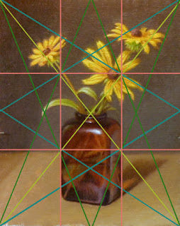
Black-eyed Susan, oil on panel, 8x10


Harmonic Armature

Rule of Thirds and Harmonic Armatures
Are compositional tools that place the focal points or center of interest on the points of intersection, and considers the location of elements based on those lines and intersections. Composition is the aesthetic location of elements in a picture, the Rule of Thirds assists in locating the intervals that the human brain most favors as the point of interest and compositional harmony (harmonics) is the visual movement or pathways in a picture plane. All of which are powerful tools to help one judge and develop a intuitive sense of proportion and design (for composition).

I wanted to throw this in because although I do not sketch the armature onto the canvas I do have it marked on my view finder. I am always very conscious of these design tools when composing also understanding how the eye moves through an image. With just a little forethought, I think this armature came out nicely.
These are rather short explanations and composition is a huge topic to get into, I think, a post for another time.

Black-eyed Susan Video
You can watch the painting develop in this video. I tried to minimize the glare so you could see the painting develop in passages from the lay-in to finish. The trade off was that the color accuracy changes some through the video. But what I think it shows, and I hope you take from the video is some insight into the process of the layered method.


 Explore - Question - Learn - Enjoy, Jim


Further articles on this topic by Jim Serrett
Charcoal Demonstration, sight size and comparative measurement
Underpainting Techniques – Demonstration Four - Copper Pot Video
The whole is greater than the sum of its parts, learning to simplify, Pochade Box paintings

Links
Elements of Art
Principles of Design
The Golden Mean
The Rule of Thirds